
Colour psychology is an incredibly important yet often overlooked aspect of marketing.
Harnessed correctly, colour use becomes an immensely powerful tool for persuasion.
And that’s something you’re going to want to tap into.
Interested to learn how to kill it with colour?
Then read on.
Why is colour psychology so important?
Effective use of colour can significantly increase conversions.
I’m sure you’ve seen the green button versus red button A/B test infographics that are plastered all over the web (spoiler – red beats green by 21%).

Big brands put a whole lot of time and effort into their use of colour because they recognise its potential impact.
They know that their customers are making rapid-fire, subconscious decisions about their products (consumers decisions are generally made within the first 90 seconds of encountering a product or brand) and that between 62 and 90% of that initial mental assessment is based primarily on colour.
So, a staggering 90% of the rapid judgements consumers make about products and brands, then, can be based on colour alone.

Clever use of colour can not only help consumers to differentiate between products and brands,(the iconic Pantone blue used by the Tiffany jewellery company is a great example of this), but it can also influence moods and feelings.
This means that colour is a powerful tool with which to influence consumers attitudes.
For those willing to do the necessary research, the power of colour can be harnessed to do far more than simply to stimulate purchasing intent.
With diligence, colour can be used to achieve a myriad of desired business goals such as stimulating or decreasing the appetite, energising or calming consumers, or even reducing the perception of waiting time.
How colour psychology is misunderstood and what needs to change.

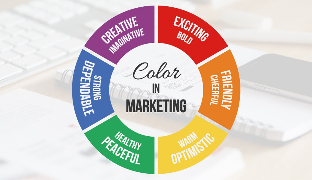
If you’ve already dipped your toes into the subject of colour psychology and how it relates to marketing and brand identity, you’ve probably come across heaps of infographics like the one above.
While the myriad of colour psychology-related infographics present the (basic) information in a simple, nice-to-look package, unfortunately, they rarely go into any depth.
This lack of depth is a significant barrier to marketers wanting to truly harness the power of colour to maximise their efforts.
The use of colour psychology in marketing is way over-simplified and therefore problematic.
Colour psychology is a complex and highly nuanced discipline, and this simply isn’t reflected in the current information that is available to businesses.
In order to take full advantage of colour theory, marketers need to understand that they are not dealing with a “one colour fits all” scenario, but a complex web of influential factors such as cultural background, personal preferences and individual experiences.

Take the colour “red” for example. In many Asian countries, red is a colour that symbolises luck and good fortune. In the west, “red” symbolises quite the opposite, namely danger.
Red can also symbolise romance and passion, or be used to stimulate the appetite. The meaning and interpretation of the colour “red” can vary greatly depending on how the colour is used.
The specific shade or tone of the colour used can also change the connotations entirely, as can the context of an ad.
Too much focus is put on the feelings, emotions and broad concepts that each colour connotes, and too little focus on how colour fits with brand identity.
How the use of colour can strengthen (or weaken) your brand identity.

Imagine Harley Davidson used a bright, vibrant pink in their next marketing campaign.
It wouldn’t go down too well, because it jars with the brand’s well established rugged identity.
The use of colour to strengthen brand values is an incredibly effective tactic and one that marketers need to hone in on.
So how do you do that?
Let’s dive in and find out.
Now, despite the fact that the aforementioned colour psychology-related infographics are grossly oversimplified, they are never-the-less still useful (sometimes) for the purpose of identifying the broader patterns relating to colour perception.
These broader concepts, however, should serve as a starting point for much deeper research.
In the spirit of digging deeper, let’s take a look at the example below and try to expand on it a little:

You might be surprised to learn that this simple graphic (taken from Pinterest) actually displays the 5 dimensions of brand personality as identified by Stanford’s professor of marketing and renowned psychologist, Jennifer Aaker.
As you can see from the infographic, it is possible to align certain colours with particular traits. Blue, for example, broadly speaking, communicates sincerity and can, therefore, be used to encourage ideas of trust and security.
According to Aaker, The “down to earth” nature of blue makes it suitable for brand personalities were “Family” or “Small town” values need to be stressed:

Blue can also be used to emphasise honesty, which is useful for those brands who need to be seen as trustworthy, such as banks, tech firms and financial institutions.
Any brand whose personality hinges on “sincerity” or “realness” would do well it seems, to use blue.
The use of blue in the example logo below is friendly and approachable:

Facebook has access to a lot of our personal data, so of course it’s imperative that their brand personality is viewed as honest and worthy of our trust.
In her research, Aaker also discovered associations of blue with wholesomeness, originality sentimentality and friendliness. All traits that coalesce to form facebook’s brand personality.
The most important thing to remember when dealing with colour from a marketing point of view is whether or not the said colour strengthens or weakens the desired (or recognised) personality of your brand.
Research on the colour of orange juice published in the journal of Sensory Studies has shown that perceived appropriateness of colour is extremely important to consumers.
If the colours you choose don’t work in harmony with your brand identity, as in the Harley Davidson example above, your customers are going to be confused and turn to competitors.
Colour psychology in logo design and branding – here’s what you need to know.

Using colour to target specific demographics.
If you are looking for a starting point to delve deeper into the relationships between colour and specific demographics like gender, or age for example, then check out Joe Hallcock’s study on colour assignment.
Hallock’s research contains many useful insights, though you should be aware that the majority of his research is based on data gathered from westerners.
One of the most interesting facts that Hallock discovered was that hands down, blue is the most favoured colour regardless of gender or age.

Using public perceptions of colour to your advantage.
By now you should recognise the importance of using both broad and narrow perceptions of colour to your advantage.
As a marketer, you need to be sure that your choice of colour is strengthening, and not at odds with, your brand’s identity.
It’s, therefore, necessary to develop an awareness of how certain colours are likely to be perceived, and Hallcock’s research can also help marketers in this area.
The strongest association with the colour blue, Hallock found, is trust, closely followed by security:

Hallock’s research also reveals interesting information pertaining to what colours are perceived to be “cheap” and which are thought to be “expensive”.
As you can see in the chart below, orange and yellow are the colours most people associate with “cheapness”. It’s no coincidence that Amazon uses these colours predominantly in order to strengthen the idea that they consistently offer great value:

How to use colour effectively.

First, a note about tints and shades.
Several recent studies on colour perception and preferences have shown that when it comes to what shades, tints and hues people respond best to, there is, in fact, a clear difference between men and women.
A shade is a colour to which a varying amount of black has been added.
A tint is the same colour with white added.
You can see the difference in the diagram below:

In general terms, men tend to prefer bold colours and shades (colours with some black added).
While women respond better to softer colours and to those with tints (white added).
This is important to bear in mind if your brand is gender-specific or if you want to align your brand personality with “masculine” or “feminine” values.
Don’t forget that in today’s climate of gender fluidity, effective marketing campaigns can (and should) deliberately play with these expectations for maximum impact.
How to create effective colour combinations.
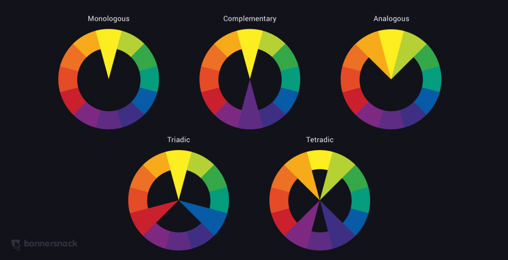
The diagram above shows 5 basic methods for creating a colour scheme. Each is made using a simple colour wheel.
You can use these as a template to create your logo, website design or campaign.
The first one (monologous) uses only one colour. However, shades or tints can vary greatly.
Does your brand personality require you to seem like you always have it together?
A monologous palette creates a polished look because all the colours have the same base: here’s an example of a monolgous palette based on the colour red:

Monologous palettes are soft and subtle, this makes them an ideal base to add a single complementary colour to attract attention.
Complimentary colour schemes simply use 2 colours that are opposites on the wheel, like green and pink. This is a great way of creating high contrast, which is very important for grabbing attention and encouraging action:
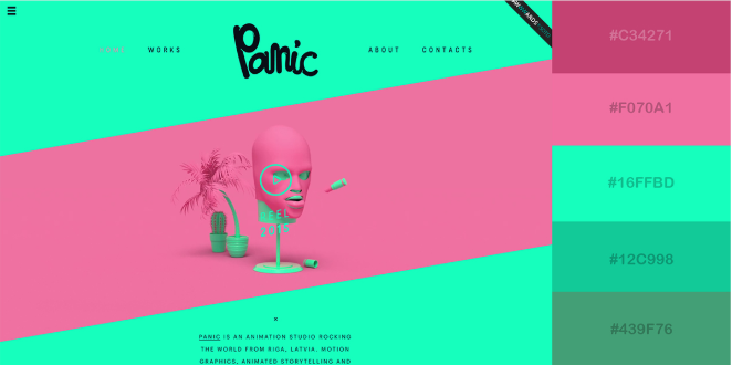
Be careful not to use complementary colours in equal measure, as this causes the eyes to strain which is offputting.
Analogous colour schemes use any 3 colours that sit together on the wheel.
This type of colour scheme is relaxing and pleasing and can help you to convey a sense of harmony and balance. Here’s a good example using red, orange and yellow:
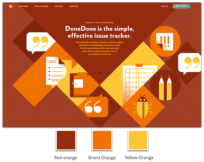
It’s important to note that because of the harmonious nature of the analogous scheme, you may wish to add an accent (or complementary) colour to this mix in areas where you need to focus peoples attention.
Triadic and tetradic combinations.
This may sound complex, but all you need to do to create this type of effective colour scheme is to make either a triangle, a rectangle or a square inside the wheel:
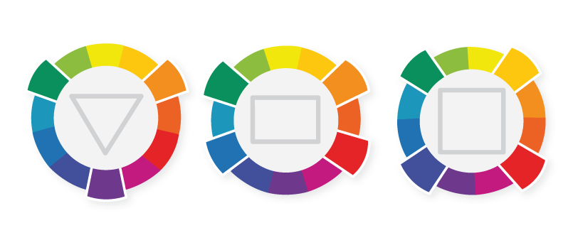
Choosing the triadic or triangle shaped one involves selecting 3 colours that are evenly spaced around the wheel.
A good way to think about this is in terms of background colour, base colour and accent colour as in the image below:

A tetradic (square-based) combination should give you 2 matching (or complementary) pairs of colours, like red and green, and blue and yellow.
These last 2 schemes can get a little noisy if they are not handled with care, so it’s probably best to work with a designer if you are using triadic or tetradic combinations.
Let’s wrap this up.

Colour is an essential tool in the marketer’s arsenal and one that can be used to greatly improve marketing efforts and to catapult businesses and brands to the next level.
Colour is extremely important, mainly because people rely on it to make snap decisions about your product or brand (in 90 seconds or less!).
Colour is how you guide your audience to see what you want them to see, to feel what you want them to feel, and most importantly, to do what you want them to do.
If you use it well, colour can encourage more people to recognise your brand, click your CTA, read your pop up, or engage with your message.
Colour also affects useability, readability and the overall effectiveness of your brand’s message.
Those that are willing to put in the research and study the feelings, emotions, perceptions and relationships surrounding colour and branding will likely be well rewarded.
By familiarising ourselves with the ways in which colour choice and use can strengthen and/or weaken brand identity, we can learn to understand the actions and behaviours of our target markets and ultimately become better influencers.